Customer Segmentation with RFM
How to identify your most valuable customers
I write about JavaScript, nodeJS, MongoDB and React.
I have always been a fan of personalized marketing. It makes me feel like I matter, and I guess that’s the point. From the business side, personalization is a proven revenue driver.
However, I never really stopped to think about the mechanics of it. How do businesses determine who to personalize for and how?
Well, I was following a series on Towards Data Science about Exploratory Data Analysis (EDA), and it introduced me to RFM analysis, one of the frameworks marketers use.
RFM is a behavioral segmentation technique that groups customers based on their purchase history with your brand.
RFM stands for:
Recency (R): How long has it been since their last purchase? : The more recently a customer has purchased, the more responsive they are likely to be to promotions.
Frequency (F): How often did they buy from you? A high frequency means they buy often. These customers sustain your business.
Monetary: How much did they spend? A high monetary value means they spend a lot.
A combination of these metrics will give you a good view of who your best customers are and who’s at risk of never shopping from you again.
Why should you care?
Most businesses treat all their customers the same way. Everyone gets the same emails, the same discounts, the same everything.
This is inefficient. Your best customers and your at-risk customers need completely different psychological triggers.
This is especially true if you have a limited budget. Would you rather spend 5K trying to win back someone who bought a $10 item a year ago, or nurturing someone who spends $100 monthly?
How to actually do it
The process is surprisingly straightforward.
Gather your data
You need a transaction log containing customer identifiers, purchase dates, and how much they spent. You probably already have this in your CRM.
Calculate the R, F, and M values
For each unique customer, calculate:
Recency: Subtract their last purchase date from today’s date. Pro tip → Add 1 to today’s date so you never get a recency of 0 if their last purchase was today.
Frequency: Count the total number of purchases they’ve made during your analysis period (e.g., the past 12 months).
Monetary: Add up all their spending during your analysis period.
Score each metric
Now you rank customers on each metric, usually on a scale of 1 to 5:
Recency: This is an inverse scale. The lower the days, the higher the score.
Top 20% (most recent) —>Score 5
Bottom 20% (oldest) —> Score 1
Frequency & Monetary: These are direct scales. Higher is better.
Top 20% (most frequent/highest spend) —> Score 5
Bottom 20% —> Score 1
There are different scoring techniques you can use. Three popular ones are:
Percentile-based scoring (quantiles): You split the database into equal parts. It’s fair, but relative. If everyone is a bad customer, the best of the bad ones still gets a 5.
Fixed threshold: Set specific cutoff points based on business logic (e.g., "You only get a 5 in Frequency if you've bought 10+ times"). This allows you to track improvements over time, as the bar doesn't move.
Standard deviation: Assign scores based on how far each customer deviates from the mean. For example, 5 = more than 1.5 standard deviations above the mean and 1 more than 1.5 standard deviations below the mean.
Combining and segmenting
Method A: Concatenation
Simply stick the three numbers as a string.
For example, R = 5, F = 4, M = 3 → RFM Score = "543".
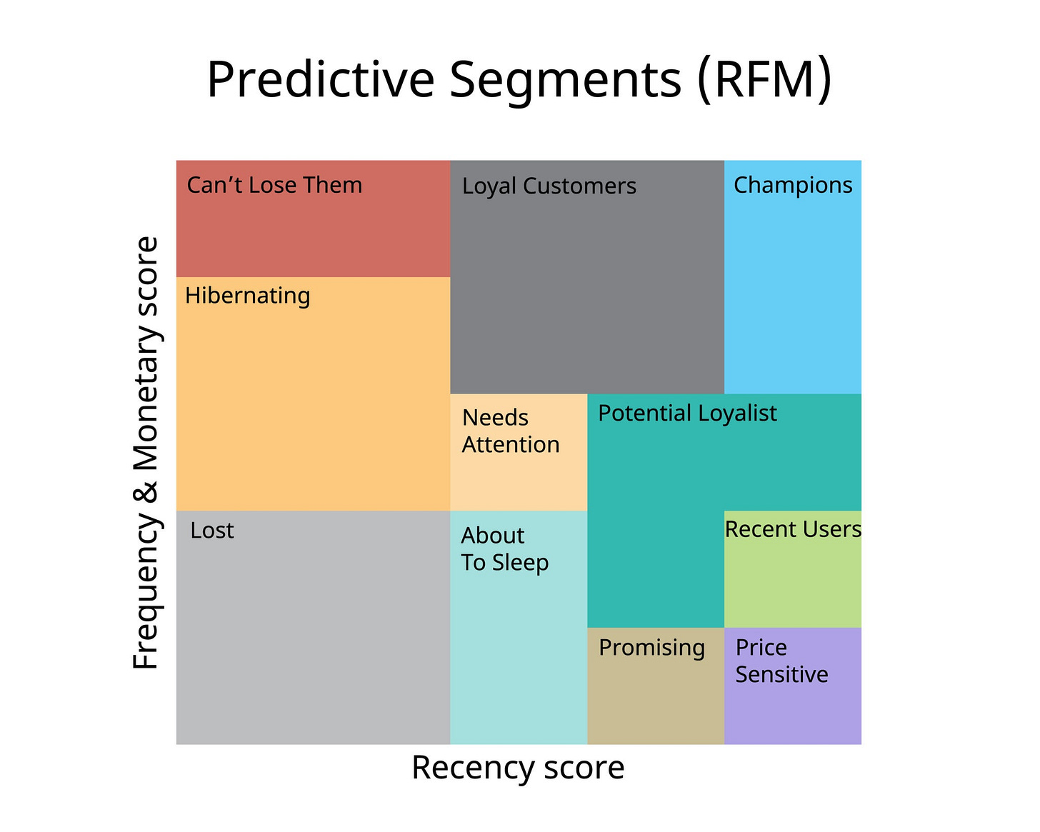
This creates 125 possible permutations. Since 125 segments are too many to manage, we group them into named segments based on the logic of the scores.
Champions (555, 554, 545): Reward them. Give them early access, exclusive perks, and ask for reviews.
Loyal customers (X4X, X5X): They buy often. Introduce them to higher-margin products or cross-sell related items.
Potential loyalist (41X, 51X): They purchased recently but rarely. Offer a loyalty program or membership to increase stickiness.
Can’t lose them (155, 255): They used to spend big and often, but haven't been seen lately. Something is wrong. Send personalized outreach or massive incentives.
Hibernating (3XX, 2XX): They are drifting away. Offer relevant recommendations based on history.
With this method, you can easily see the individual values, so you can still create very specific groups like all customers with r=5 regardless of f and m.
Method 2: Weighted scores
Assign different weights to R, F, and M based on business goals. For example, you can place higher importance on monetary value if you sell luxury goods:
RFM Score = (Recency × 0.3) + (Frequency × 0.2) + (Monetary × 0.5)
A weighted addition will give you a single numerical score you can rank.
Segmenting using ML algorithms
Instead of manually defining segments, use machine learning clustering algorithms like K-means, hierarchical clustering, or DBSCAN to let the data tell you what the natural customer groups are.
For example, K-Means looks at the raw data and finds mathematical similarities between customers that a human might miss.
It might find a group of customers who buy specifically every 45 days with a low monetary value.
RFM analysis in practice
Alright, theory is great, but let’s see how this actually works with real data. I’m using the online retail dataset from the UCI Machine Learning Repository.
It’s a popular dataset that contains transactions from a UK-based online retailer between 2010 and 2011.
The dataset includes:
InvoiceNo: The transaction ID
StockCodes: Product ID
Descriptions: Descriptions of products
Quantity & UnitPrice: Essential for calculating monetary value.
InvoiceDate: When they bought it
CustomerID: Who bought it
Country
Dataset and sampling
The original dataset contains over 500,000 rows. To keep iteration fast, I worked with a 10% random sample.
import pandas as pd

SAMPLE_FRACTION = 0.1
FILE_PATH = './data/online_retail.xlsx'

full_df = pd.read_excel(FILE_PATH)
df = full_df.sample(frac=SAMPLE_FRACTION, random_state=42).reset_index(drop=True)
Using random_state=42 ensures I get the same sample every time I run the code.
Cleaning the data
I started with the usual checks: .head(), .info(), and .describe().
3 issues stood out immediately:
Negative quantities in the
QuantitycolumnZero values in
UnitPriceMissing values in the customerID and description rows
Since my goal is to measure positive revenue and valid customer behavior, I removed the negative quantities and zero values in unit price.
I also dropped rows where we didn’t know who the customer was (missing IDs).
#drop rows with missing customer Ids
df = df.dropna(subset=['CustomerID'])

# Keep only positive sales
df = df[(df['Quantity'] > 0) & (df['UnitPrice'] > 0)]

# Remove cancelled orders where InvoiceNo starts with C
df = df[~df_customers['InvoiceNo'].astype(str).str.startswith('C')]

# Remove duplicates
df = df.drop_duplicates()
Creating the revenue column
Revenue is the foundation of the monetary metric.
# Calculate revenue per transaction
df['Revenue'] = df['Quantity'] * df_customers['UnitPrice']
Calculate the RFM metrics
We need to group the data by CustomerID and calculate:
Recency: Days since the last purchase.
Frequency: Count of unique invoices.
Monetary: Sum of total revenue.
from datetime import timedelta

# Set analysis date (one day after last transaction in dataset)
analysis_date = df['InvoiceDate'].max() + timedelta(days=1)

# Calculate RFM metrics
rfm = df.groupby('CustomerID').agg({
    'InvoiceDate': lambda x: (analysis_date - x.max()).days,  # Recency
    'InvoiceNo': 'nunique',                                    # Frequency
    'Revenue': 'sum'                                           # Monetary
}).reset_index()

# Rename columns
rfm.columns = ['CustomerID', 'Recency', 'Frequency', 'Monetary']
To calculate the recency, you’ll need a reference date. I chose to use one day after the last transaction in the dataset. If a customer bought something today, the recency is 1 and not 0.
What does the data look like?
print(rfm[['Recency', 'Frequency', 'Monetary']].describe())
Key findings:
Recency: Half of the customers purchased within the last 2 months. 20% are inactive for 6+ months
Frequency: 40% of customers bought only once. The median was 2 purchases
Monetary: Median spend was $78, but the range went up to $77,183 (likely bulk/B2B order)
Scoring the customers
Each customer gets a 3-digit identifier:
We need to convert those raw numbers (days, dollars) into a 1-5 score.
We use pd.qcut (Quantile Cut) to split the data into 5 equal buckets (quintiles).
- Recency: Lower is better (Score 5 = Top 20% most recent), so we’ll reverse it.
rfm['R_Score'] = pd.qcut(rfm['Recency'], q=5, labels=[5, 4, 3, 2, 1])
- Frequency: We use .rank(method=’first’) because many customers are tied with 1 purchase. Without ranking, qcut wouldn’t create unique bins.
rfm['F_Score'] = pd.qcut(rfm['Frequency'].rank(method='first'), q=5, labels=[1, 2, 3, 4, 5])
- Monetary
rfm['M_Score'] = pd.qcut(rfm['Monetary'], q=5, labels=[1, 2, 3, 4, 5])
Combine the metrics into a 3-digit score.
rfm['RFM_Score'] = (rfm['R_Score'].astype(str) +
                    rfm['F_Score'].astype(str) +
                    rfm['M_Score'].astype(str))
print('Sample RFM scores')
print(rfm.head(10))
While a score of 451 is precise, it’s not helpful for the marketing team. We need to translate these numbers into human-readable personas.
def create_segment(row):

    r, f, m = int(row['R_Score']), int(row['F_Score']), int(row['M_Score'])

    if r >= 5 and f >= 5 and m >= 5:
        return 'Champions'
    elif f >= 4 and m >= 4:
        return 'Loyal Customers'
    elif m >= 4 and f <= 2:
        return 'Big Spenders'
    elif r >= 4 and f <= 1:
        return 'New Customers'
    elif r >= 4 and f >= 2:
        return 'Potential Loyalists'
    elif r <= 2 and (f >= 4 or m >= 4):
        return 'At Risk'
    elif r <= 2 and f <= 2:
        return 'Hibernating'
    else:
        return 'Need Attention'

rfm['Segment'] = rfm.apply(create_segment, axis=1)
print(rfm.head())
Now, instead of staring at a spreadsheet of ID numbers, you have a clear action plan:
Champions: Send them a “Thank You” note.
At Risk: Send them a “We Miss You” coupon.
New Customers: Send them a welcome Series email.
Let’s see how many customers are in each segment:
segment_counts = rfm['Segment'].value_counts().reset_index()
segment_counts.columns = ['Segment', 'Customer_Count']

# as percentage
total_customers = segment_counts['Customer_Count'].sum()
segment_counts['Percentage'] = (segment_counts['Customer_Count'] / total_customers * 100).round(1)
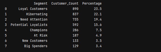
There’s a retention problem: When you add up Hibernating (22.1%) + need attention (19.4%) + at risk (4.9%), that’s 46.4% of customers who are either gone or on their way out. Nearly half the customer base needs some kind of intervention.

But there’s also a huge opportunity in the middle. Potential loyalists (15.6%) + new customers (3.5%) = 19.1% could be converted to loyal or champion status with the right approach. That’s almost 725 customers who are showing positive signals.
If this were my business,, I would focus my energy here. These customers are already engaged. They just need a reason to make that second or third purchase.
The champions and loyal customer segment is actually pretty small. Less than a third of the total customer base is doing most of the heavy lifting.
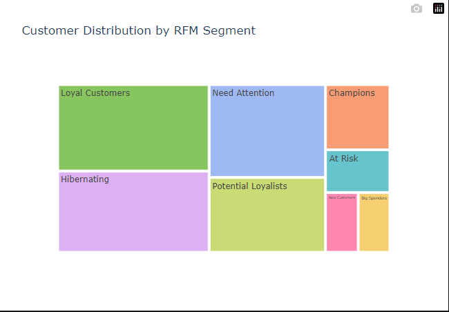
Visualize the segments
Create a treemap using plotly.
import plotly.express as px

# create treemap
fig = px.treemap(
    segment_counts,
    path=['Segment'],
    values='Customer_Count',
    color='Segment',
    color_discrete_sequence=px.colors.qualitative.Pastel,
    title='Customer Distribution by RFM Segment',
    hover_data=['Percentage'] # Shows % when you hover over the block
)

fig.show()
One last thing, you don’t have to use Pandas for this. Excel works just fine. I went the Python route because that’s what I’m more comfortable with.